2015 Year in Review Electricity Market Performance 2015
Purpose of this document
This review highlights important events and trends in the electricity market during 2015.
It provides an overview of the performance of the electricity market and is intended for industry or other interested audiences.
This review covers the 2015 calendar year. This is the fifth time the Electricity Authority (Authority) has published an electricity market performance year in review.
Executive summary
In 2015 we saw increased electricity demand, small and medium-sized retailer growth increasing at an even stronger rate than previously seen and prices for residential consumers holding steady.
Electricity demand increased for the second year in a row
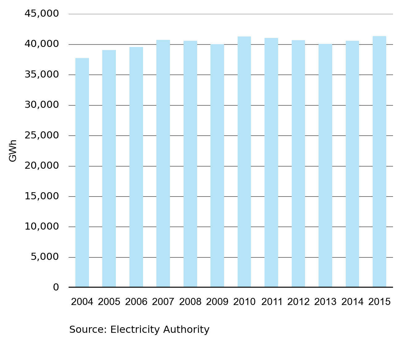
There was a slight increase in electricity demand in 2015, up from 40,602 GWh in 2014 to 41,342 GWh in 2015–an increase of 740 GWh or 1.8 per cent. Demand has been relatively flat since 2008, and it remains to be seen whether the increase in 2015 is the start of an extended period of demand growth.
Retail market competition remains intense
The retail electricity market was again characterised by innovative pricing plans, fast growth in the pre-pay electricity space, and more bundled product offerings. While the biggest four retailers still have close to 80 per cent of market share, it was the small and medium sized retailers who enjoyed growth. Notable in 2015 was the rise of Trustpower, which overtook Meridian to become the fourth largest retailer serving the residential electricity market. Trustpower, Nova and Flick were the fastest growing retailers in 2015.
Competition is constraining price rises for consumers
The strong retail market competition we have seen over the last five years successfully constrained price increases in 2015. This was illustrated by Statistics NZ’s Consumer Price Index (CPI) result for the year ending June 2015 which showed a 0.0 per cent annual rate of change in electricity prices paid by households.
Splitting the Quarterly Survey of Domestic Electricity Prices (QSDEP) into the energy (the competitive part of the sector) and lines (the monopoly part of the sector) components shows that energy’s contribution to the overall cost of electricity measured by the QSDEP hasn’t changed in real terms since March 2011.
The hedge market hits new trading records
The electricity hedge market continued to prosper in 2015. Australian Stock Exchange (ASX) New Zealand electricity futures contracts hit record trading volumes in August with around 2,300 GWh traded. This increase in trading volumes is an indicator of improving liquidity in the market. In November 2015 a change was made so futures and options contracts could be traded at a 0.1 MW sized contract. Previously, the minimum trade volume was 1 MW. It will be interesting to observe the impacts of this change in 2016.
Unmatched open interest (UOI) across ASX contracts also continued to increase, peaking in the December 2015 quarter with over 4,700 GWh of open interest for baseload futures—a figure equivalent to 11 per cent of annual physical demand. Electricity futures contracts provide a very important tool for retailers to manage wholesale price risk, and prices are generally more efficient when markets are more liquid.
The market handled a low hydro storage situation as expected
Seven day moving average spot prices increased to around $130/MWh at the height of summer, as storage levels declined, before prices returned to lower levels, at $40/MWh to $60/MWh, in the winter months when storage was abundant, despite the higher demand. Spot prices provide an important signal; they inform the market about potential security of supply risks and allow thermal plant to increase production so that hydro storage can be conserved for later.
A major trend in 2015 was the reducing role played by thermal generation. Thermal generation was down by around 26 per cent when compared to the previous five years. This change has been largely brought about by the increased amount of wind and geothermal generation being offered into the wholesale market, which has displaced thermal plants. With the confirmed closure of Southdown and Otahuhu B the output from thermal plant may reduce even further in 2016.
The Penrose inquiry has provided useful lessons for the industry as a whole
The Authority completed several market performance reviews in 2015. The most significant was the inquiry requested by the Minister of Energy and Resources under Section 18 of the Electricity Industry Act 2010 into the Penrose substation fire of October 2014. The fire left some parts of Auckland without electricity for two days.
The inquiry highlighted the need for risk managers to identify and manage critical assets—assets which if lost, cause widespread disruption to consumers. The inquiry also showed the importance of risk identification systems being sensitive to risks that develop incrementally over long-periods of time. These are lessons that the wider electricity industry, not just electricity lines businesses, can learn from.
Three thermal generators signalled intentions to close thermal stations
Contact Energy Limited announced that the 380 MW Otahuhu B thermal station would close in September 2015. Mighty River Power Limited announced that the 175 MW Southdown station would close in December 2015, and Genesis Energy Limited announced a timetable to permanently close the remaining two coal-fired units at Huntly by 2019.
All three companies cited growth in New Zealand’s renewable generation as contributing factors to their decisions.
Demand
Annual electricity demand increased slightly compared to previous years, but it is too early to tell whether this is the start of a new phase of growth.
Between 2007 and 2015, total annual electricity demand was between 40,000 GWh and 42,000 GWh. While there are daily, weekly and seasonal variations in electricity demand, overall annual demand has remained remarkably stable.
However, Figure 1 shows slightly higher total demand for 2015. This is probably due to New Zealand’s improved economic performance and increased net migration.
Figure 1: Total Electricity demand for 2004–2015
Peak demand remained around 6,700MW
Peak demand drives many of the costs in an electricity system, particularly in transmission and distribution. Peak demand also drives the need for generation plant that can operate for short periods of time at high output. As trading periods with peak demand tend to bring high prices, peaks can be reduced by demand switching off in response to these high prices.
Figure 2: Peak Electricity demand for 2004–2015
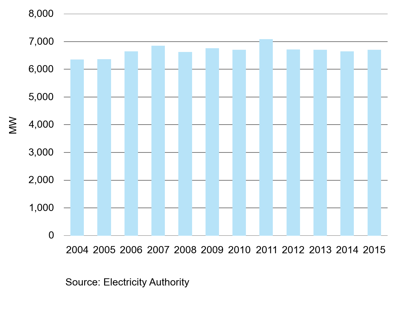
Figure 2 shows peak demand (ie. the highest total half-hourly demand) for 2004 to 2015. Like total annual demand, peak demand for 2007 to 2015 has remained remarkably stable during this period, at approximately 6,700 MW. The very high peak in 2011 was caused by a severe snow storm that swept the country.
Month-on-month demand increased sightly in 2015
Electricity demand follows the seasons with demand highest in July. Demand then falls between August and February as the temperature returns to levels where less heating is required.
Figure 3: Monthly demand compared to average demand
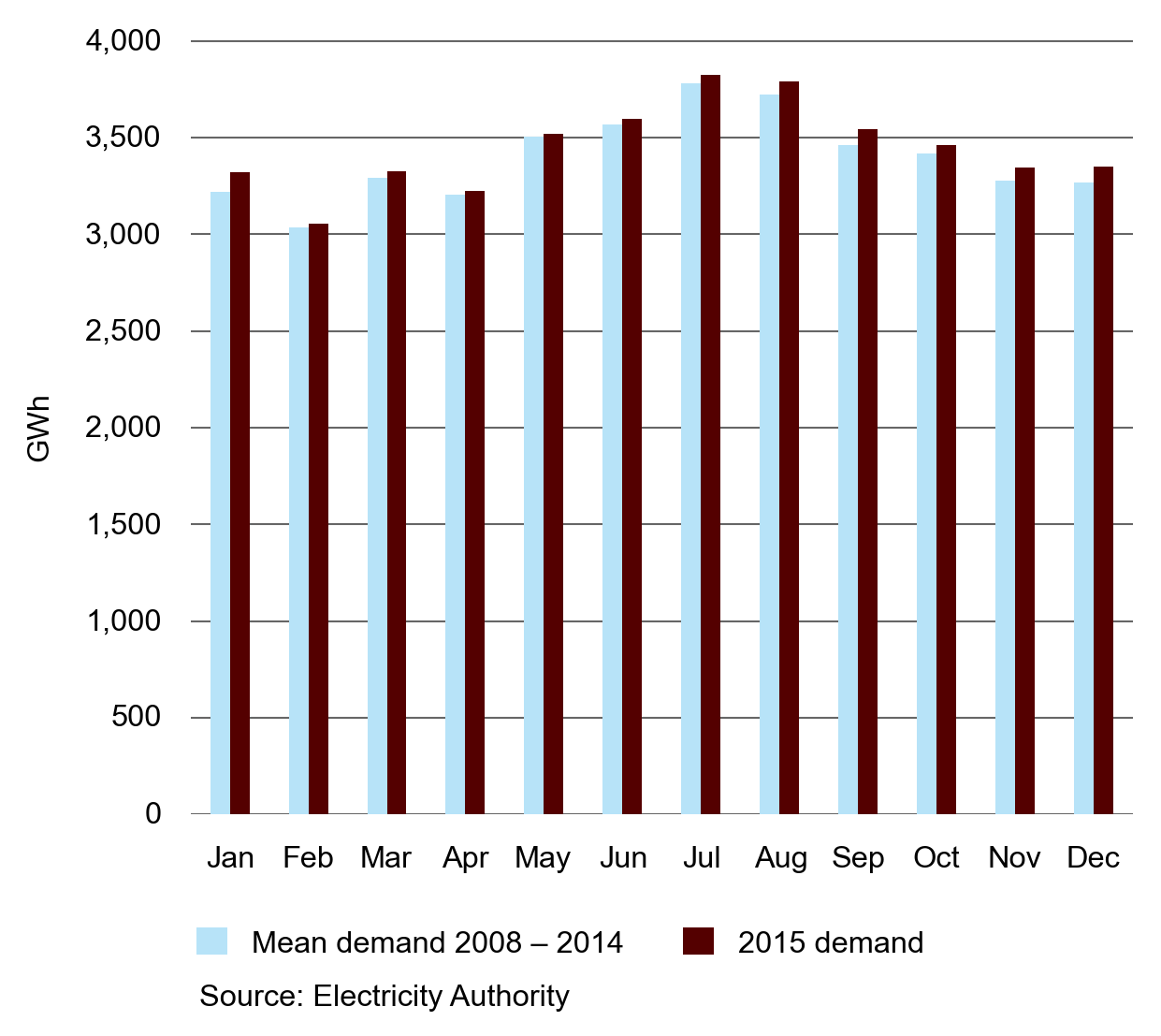
Figure 3 shows a comparison between the mean monthly demand over the period 2008 to 2014, with monthly demand in 2015. Electricity demand in every month of 2015 exceeded the average for 2008–2014, although the difference in some months was small.
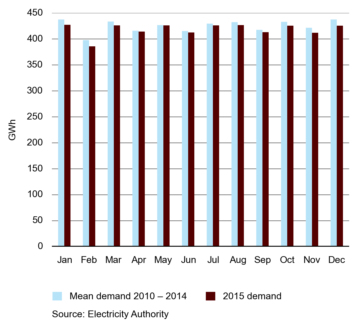
Figure 4 shows monthly demand at Tiwai for 2015 compared with 2010–2014. Figure 4 shows that demand at Tiwai in 2015 was slightly below average. The Tiwai Point aluminium smelter uses around 13 per cent of New Zealand’s electricity.
Figure 4: Monthly demand at Tiwai
We published a study of total demand in 2014.
The study showed that economic growth and population growth were important drivers of electricity consumption.
According to the Reserve Bank of New Zealand, “Growth in the New Zealand economy has softened over 2015, due mainly to lower terms of trade. Combined with increases in the labour supply from strong net immigration, the slowdown has seen an increase in spare capacity and unemployment. A recovery in export prices, the recent lift in confidence, and increasing domestic demand from the rising population are expected to see growth strengthen over the coming year .” [1]
How these economic drivers balance over the longer term will determine if the slightly higher than average demand experienced in 2015 is a trend, or just variation caused by yearly changes in weather and other demand drivers.
--
1. http://www.rbnz.govt.nz/monetary-policy/monetary-policy-statement/mps-december-2015
Retail
New Zealanders continue to enjoy a highly competitive retail electricity market. In 2015 we saw improvements across the structure, conduct and performance element we measure.
We assess competition using the structure, conduct and performance model
We use structure, conduct and performance to assess the competition of the retail electricity market. Taken in isolation these indicators are limited, but the combination of all three gives an informative assessment of competition levels.
Structure: Concentration measures continue to fall
Market structure is a useful indicator of competition because competition tends to be stronger where more players are in a market and when no single player has a large share of the market. We use the Herfindahl-Hirschman Index (HHI) and the concentration ratio (CRX) to assess trends in market structure.
HHI is the sum of squares of the percentage market shares in a particular market—this calculation gives more weight to players with large market shares. CRX is the sum of the market shares for X players (for example, CR4 is the sum of market shares for 4 players). As New Zealand is split into regional markets, we calculate national figures using customer weighted averages of the regional HHIs and CRXs.
There are five large retailers and a competitive fringe of small and medium-sized retailers. As the number and market share of retailers in the competitive fringe increases, both HH and CRX decline.
CRXs are calculated for an increasing number of retailers from 2004 to 2015. The CR4 shows the fall in market share of the four largest retailers since 2009. This shows the impact that the fringe of small and medium retailers is having. The CR1 shows how the largest retailer in each region has suffered a fall in market share over the period shown in the chart.
Figure 5: HHI and CRX for residential market
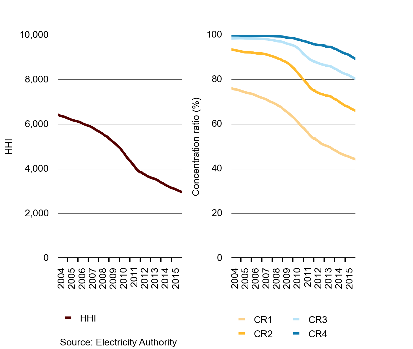
Figure 5 shows the national HHI and CR 1–4 for the residential retail market. From 2004 to 2015, the HHI value decreased from a high of 6,400 to approximately 3,000. This is an indication of the increased competitiveness of the residential retail market.
Structure: Small and medium retailers continue to grow
The rapid growth of small and medium retailers continued in 2015 with new entrants successfully entering the market and growing their customer bases.
Figure 6: Market size for large and small retailers in the retail market
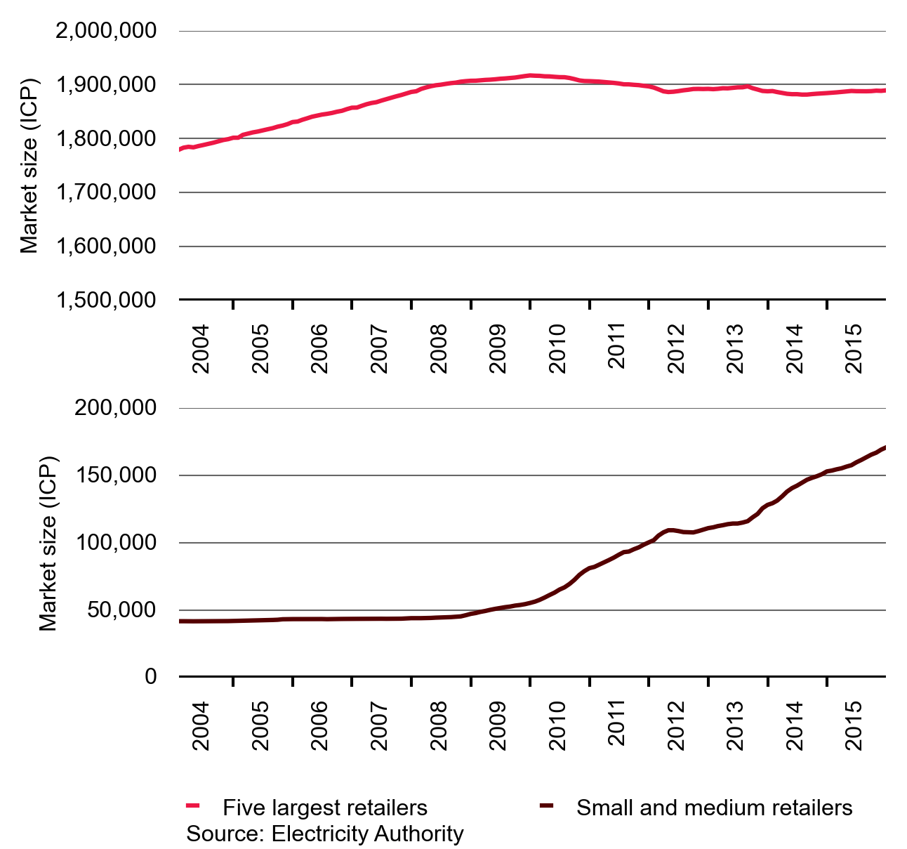
Figure 6 shows a comparison between the market sizes of the five largest retailers, by parent company, and the rest of the retailers. The market share for small retailers has increased since 2009 and continues to grow.
Small and medium retailers now have over 170,000 customer connections. In comparison, the total market size of the largest five retailers has been steady in recent years. This aggregate statistic hides the changes within the large retailer group; Contact Energy Limited lost over 11,000 customers while Trustpower Limited gained about 16,000 customers in 2015.
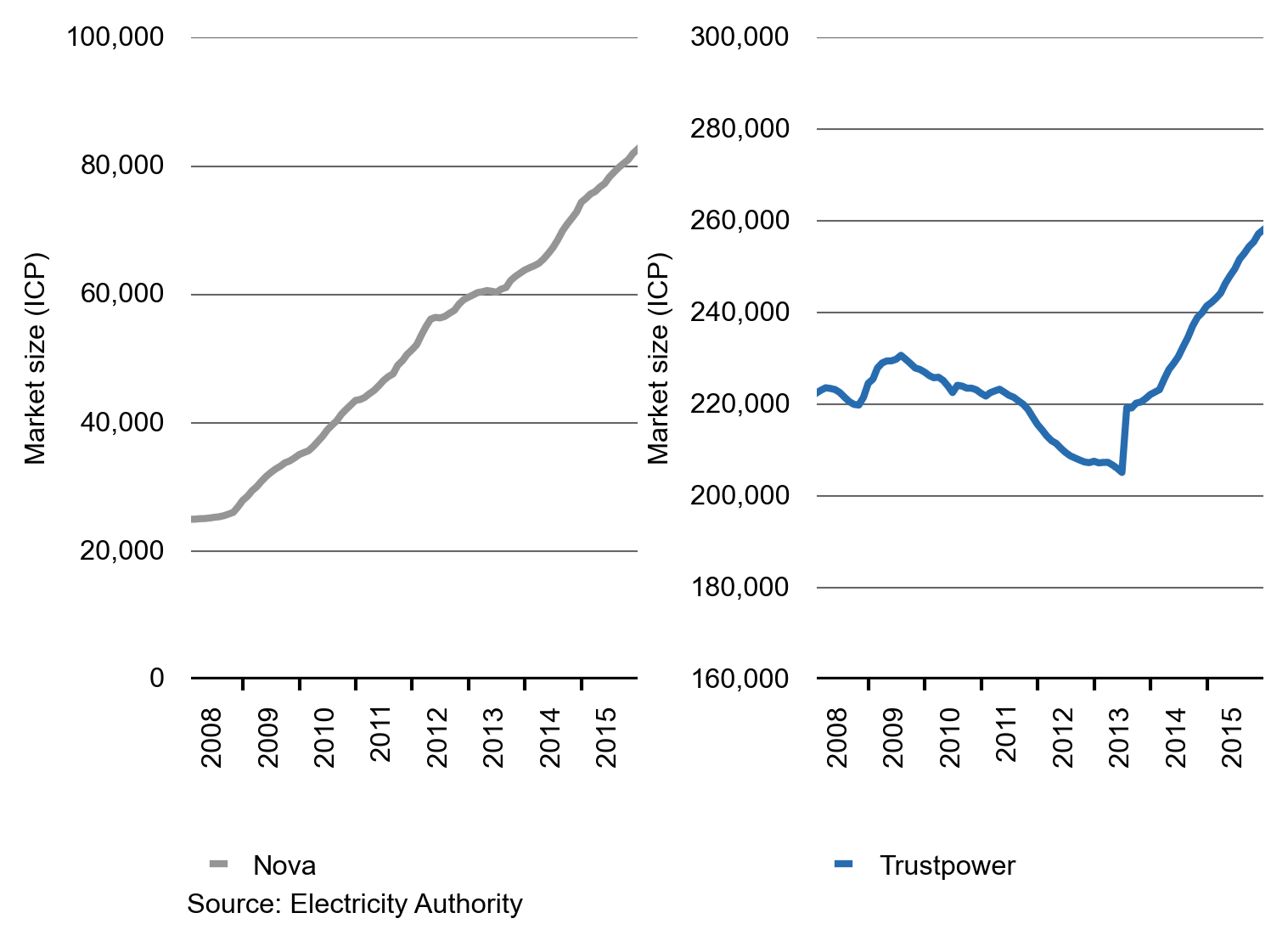
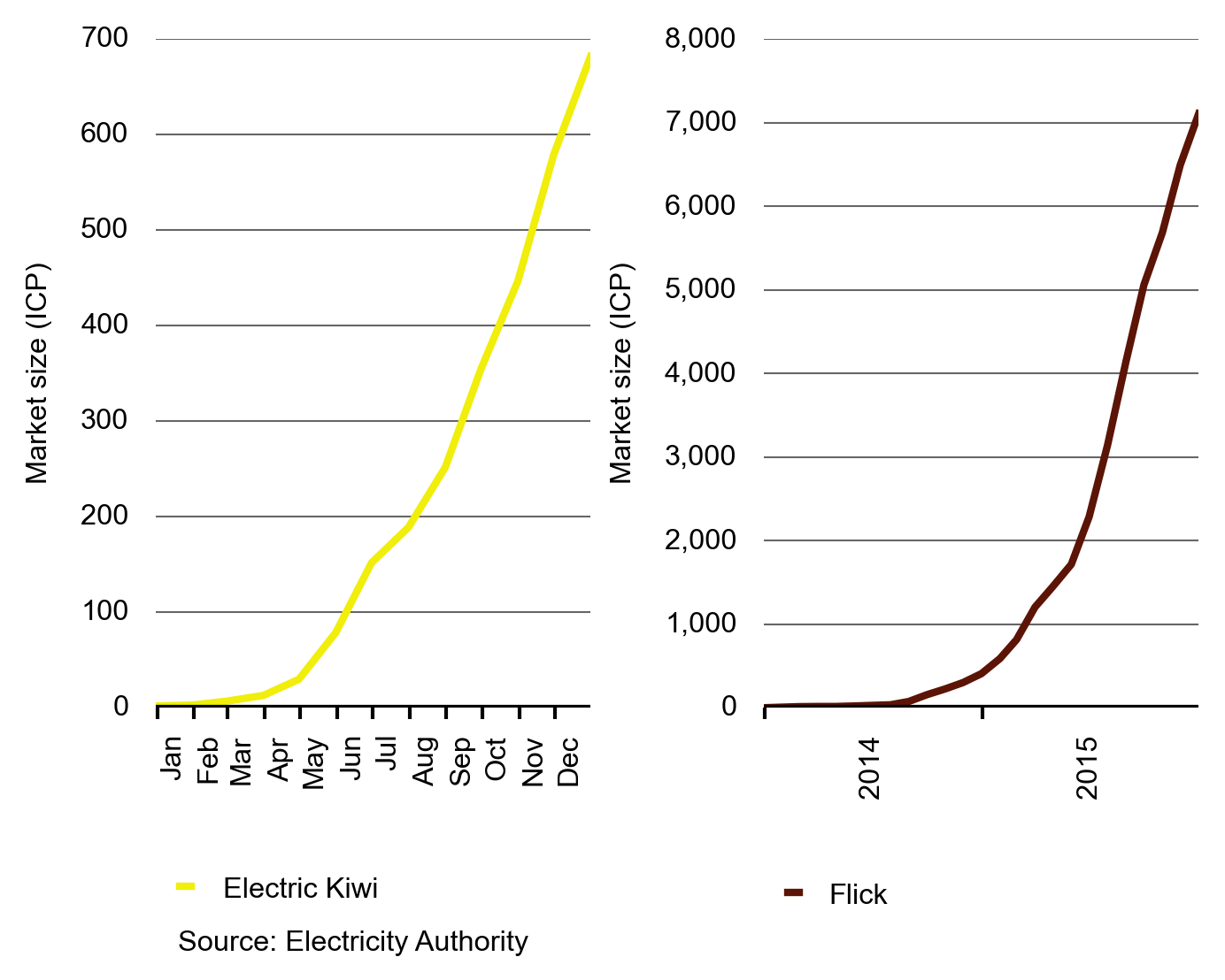
Figures 7 and 8 show the market sizes for a selection of retailers. Nova, Trustpower and Flick were the fastest growing retailers in 2015. Figure 7 shows that Trustpower has been growing consistently since mid-2013, and Nova has been growing consistently since 2008.
Figure 7: Market size for Nova and Trustpower
Electric Kiwi started in 2015 and has grown consistently since then with nearly 700 customer connections by 31 December 2015. Flick has been operating for two years, expanding into new centres and marketing more heavily during 2015. This appears to be paying off as it grew at a rapid rate in 2015, finishing the year with over 7,000 customer connections.
Flick offers residential consumers a retail contract that allows them to purchase their electricity at the wholesale price. Wholesale prices are volatile, so consumers take the risk of wholesale prices rising, which they do when energy is scarce (for example when hydro storage is low). Conversely they benefit when prices are low (for example when hydro storage is high).
Figure 8: Market size for Electric Kiwi and Flick
Conduct: Retail innovation increased in 2015
In 2015 Trustpower gained customers by focusing on North Island urban markets. Trustpower’s innovative offers include bundling electricity with natural gas, LPG and broadband services.
Saveawatt has announced it is entering the retail electricity market offering a new proposition for consumers. Consumers will delegate authority to Saveawatt who will then make sure the consumer is on the best tariff at all times, switching them as required.
Globug (a Mighty River Power retail brand) grew rapidly in 2015, increasing from 18,000 to nearly 32,000 customers. Part of the reason for the growth may be that Mighty River Power announced in early 2015 that it would discount Globug’s pre-pay rates by 15 per cent to Community Services Card holders.
Conduct: Highest year ever for consumer switching
Electricity switching numbers reached 418,057 in 2015, making it the highest ever year for switching. Figure 9 shows the trends for switches and saves in the market as retail customers select other retailers, (a switch) or change their mind about the switch and return to their retailer (a save).
Figure 9: Switches and saves
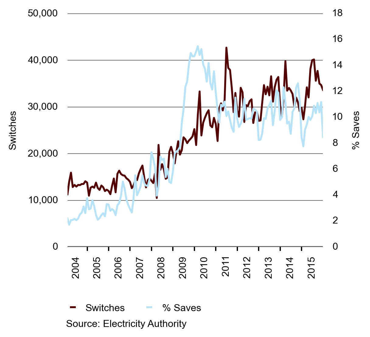
Figure 9 shows switches and the percentage of saves since 2004.
We implemented the save protection scheme on 12 January 2015 to reduce barriers for retailers to acquire new customers. This is likely to have had an impact on switching levels, although this impact has not yet been investigated. The scheme requires that retailers that choose to be part of it are able to win a customer and complete the switching process before the customer’s previous retailer can attempt to win them back. The converse is also true: if a retailer opts into the scheme and loses a customer, it cannot attempt to win that customer back until the switch is completed.
This year we completed an enquiry to see whether a consumer’s income, household composition or use of information websites influenced their switching behaviour. The enquiry looked at how consumer characteristics affect the choice of retailer—in particular the choice of whether to switch to a Big 5 (B5) retailer or a retailer who is
not part of the Big 5 (NB5).
The results showed:
- consumers in the $50,000–$70,000 income bracket were most likely to switch
- consumers without children were more likely to switch
- the youngest and oldest consumers are more likely to switch than consumers in between.
Figure 10: Household composition and switching
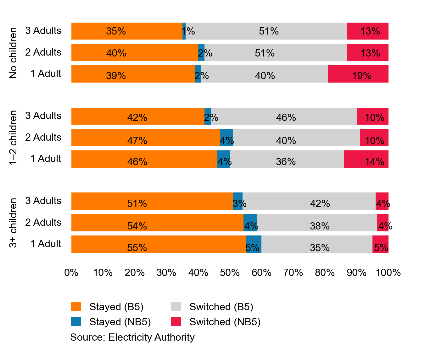
Figure 10 is an example of the empirical results from the enquiry. It shows the impact that household composition has on switching (while holding all other consumer attributes constant). Households with no children are the most likely to switch retailers (the sum of probabilities of the grey and red bars), while those with three or more children are the least likely to switch. The results are instinctively recognisable; parents are time constrained and as a result may face higher search costs than other consumers when they seek to compare competing retailer offers.
The results from this enquiry will help inform the development of future What’s My Number initiatives, to ensure a greater range of consumer segments engage with this initiative.
Performance: The competitive component of electricity prices is holding stable
To assess the performance of the retail market, we look at a range of indicators that together form a picture of the market. Figure 11 compares changes in the components that make up the Ministry of Business, Innovation and Employment’s (MBIE) QSDEP price series. The chart shows that the competitive part of the market (the energy component) has contributed very little to real total price changes since March 2011. Most of the increase in the QSDEP has come from increases in transmission and distribution costs—collectively known as lines charges. Lines charges are regulated by the Commerce Commission.
Figure 11: The energy and lines component of the QSDEP indexed (real)
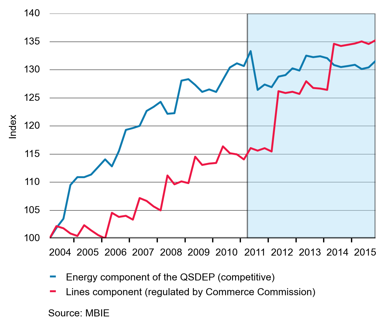
Figure 12: Breakdown of QSDEP over time (nominal)
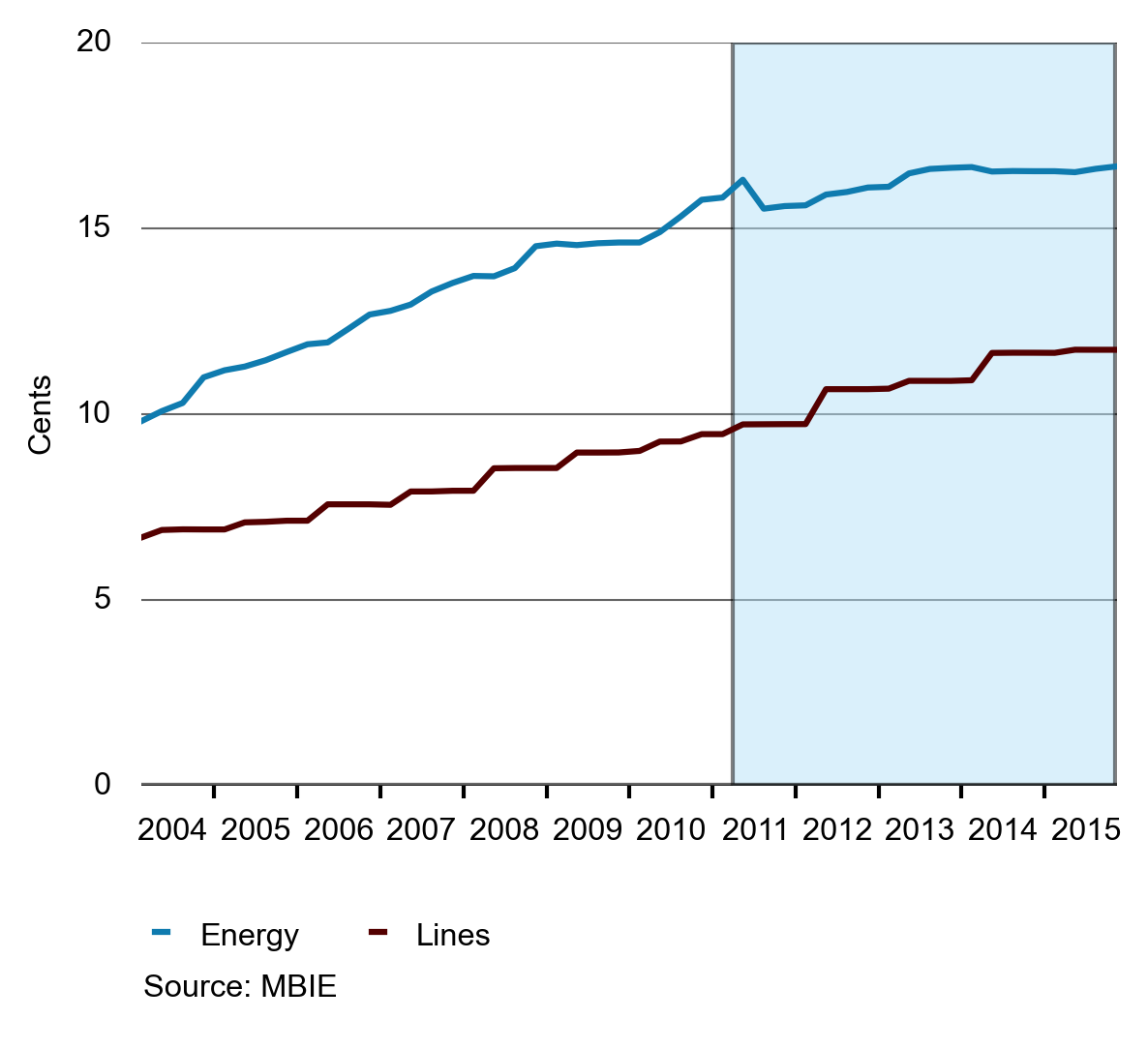
Figure 12 shows the contributions from energy, transmission and distribution to the QSDEP. Although energy is the largest component of the QSDEP, the change in the transmission and distribution components is noticeably larger than the change in the energy component since March 2011.
NZIER has indexed the estimate of costs to make comparisons in the growth rates of costs and prices easier. Costs are growing faster than prices, this suggests competition is driving down prices relative to costs. That is, prices may still be rising, but more slowly than costs due to competitive pressure. The cost index uses ASX electricity futures data, demand data, annual reports from the major energy retailers, and regulated transmission and distribution charges. The Authority is in the process of developing a new cost index that will be calculated and published on www.emi.ea.govt.nz(external link). We expect this work to be completed early in 2016.
In a competitive market we would expect prices to be set at or near costs. We ask the New Zealand Institute of Economic Research (NZIER) to calculate a cost index that uses observable market data to estimate costs facing electricity retailers. Comparing price changes with cost changes provides an indication of how well the market is performing.
Figure 13: NZIER cost index changes compared to prices
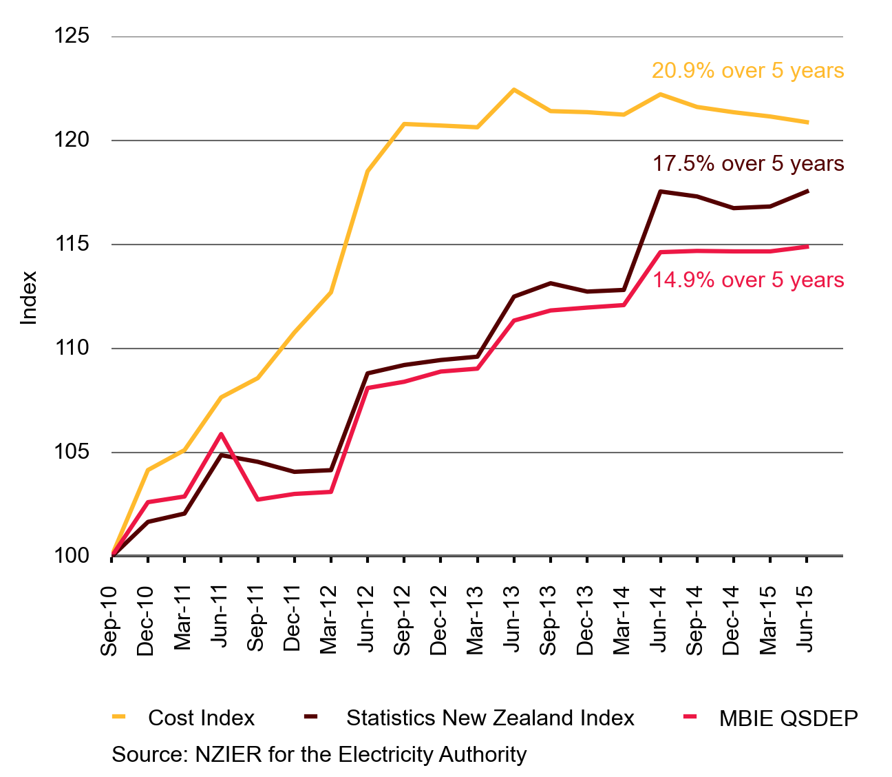
Figure 13 shows how retailer costs (the yellow line) and residential retail prices (the brown and red lines) have changed over the past five years.
The two retail price series, published by Statistics New Zealand and MBIE, have different assumptions and data in their calculation; however, they show a consistent pattern. We track both electricity price series because each has limitations. All indices are based to the third quarter 2010.
Figure 13 shows that, over the past five years, prices have increased more slowly than retailer costs. This suggests there is competitive pressure limiting retailers’ ability to ‘pass-through’ underlying cost increases to consumers.
Since September 2010, the NZIER retail cost index has shown a 20.9 per cent increase, while the Statistics New Zealand and MBIE retail price indices have increased much more slowly at 17.5 per cent and 14.9 per cent, respectively.
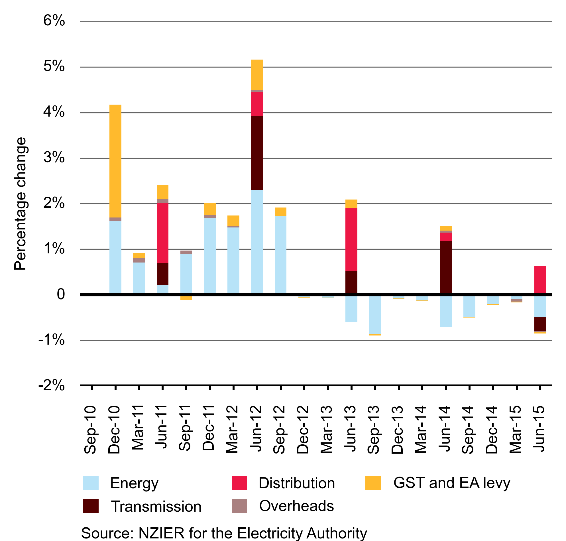
Figure 14 shows that increases in transmission and distribution costs have offset the reductions in the energy price from the first quarter in 2013 to the second quarter in 2015.
Figure 14: NZIER cost index changes by component
Metering
There are now more than 1.3 million smart meters in New Zealand and this technology is lowering costs and giving consumers access to better data. All this is happening due to market forces and without any regulatory intervention.
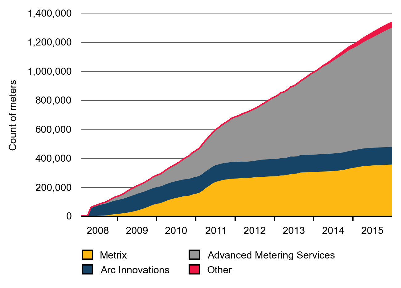
Smart meter deployment continues
The rapid deployment of smart meters continues. Figure 15 shows the speed of deployment from 2008. Arc Innovation’s meters are still identified separately in the registry, although these are now owned by Advanced Metering Services (AMS). Over 1.3 million smart meters are now deployed, which is over 66 per cent of all meters in New Zealand.
Figure 15: Smart meter deployment by provider
In 2015, we published an enquiry on the metering market. The enquiry examined the prices charged by metering service providers to retailers of varying sizes, and whether these prices constituted an inefficient barrier to entry into the retail market. The enquiry found that contract terms and conditions determined the price that retailers paid to metering service providers, and that the metering market is workably competitive. A summary of the enquiry is available at http://www.ea.govt.nz/monitoring/enquiries-reviews-and-investigations/2014/metering
The results from the enquiry showed that the terms and conditions of the contracts determine the price charged, and that metering prices are not causing a barrier to entry to the retail market. The enquiry revealed that retailers take a varying level of service from metering service providers and so pay different charges.
Smart meters lower the cost of collecting meter readings and provide more accurate data about consumption. More importantly, smart meters allow retailers to design more innovative and tailored offerings to consumers. Many of the newer retailers are making use of smart meters to develop innovative business models.
Derivative markets
The hedge market continues to thrive, clocking up a record year in 2015 with the highest ever trading volumes and unmatched open interest.
As in the retail market, we use HHI to measure concentration in the hedge market. HHI is usually a snapshot of a particular market, but the hedge market is a separate market for each quarter in the future, so HHI can be calculated for each of these quarters, as well as for past quartersAs each hedge trade has a buyer and a seller, each taking a position through the trade, we can calculate HHI on both sides of the transaction.
We monitor this because it indicates whether a participant is building a position in the market (leading to an increase in HHI over a particular time period). In this case we are monitoring conduct as much as structure.
Figures 16 and 17 show very high HHI values during 2019. This is likely due to contracts for distant future quarters being thinly traded. We tend to see that HHI for contracts declines as the traded quarter gets closer which is when trading volume typically increases.
Stucture: Low concentration in the hedge market indicates a competitive market structure
Figures 16 and 17 show HHI for the ASX for buying and selling as at 31 December 2015. Periods prior to this date show HHI for the closing positions at the end of the quarter. Periods after 31 December 2015 show HHI for open positions as at 31 December 2015.
HHI measures for the hedge market remain low for shorter time horizons indicating that concentration is low—a factor that typically contributes to the competitive pressure in markets.
Figure 16: HHI for buyers of quarterly contracts on the ASX
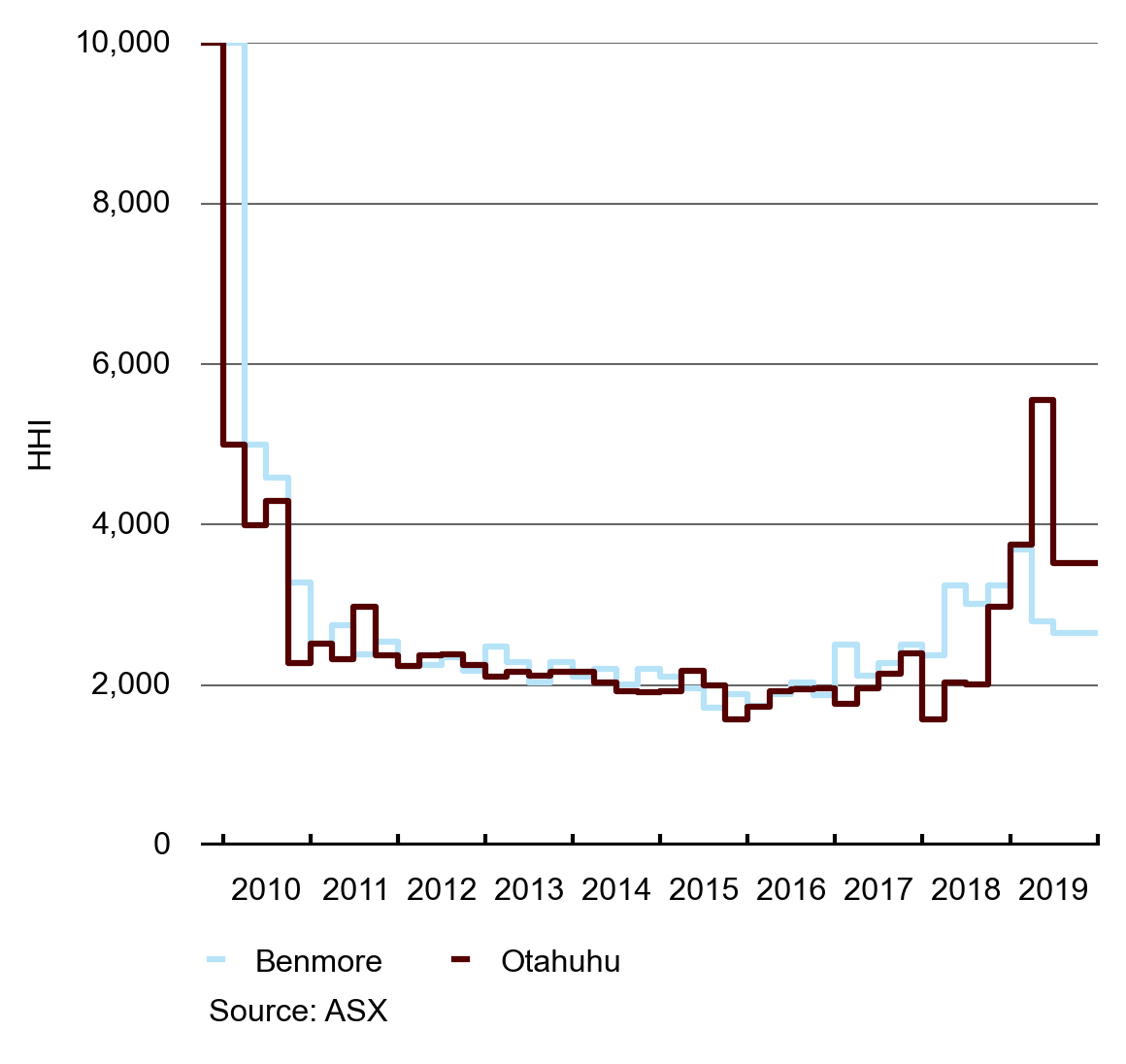
Figure 16 shows HHI values for buyers of quarterly futures contracts at Benmore and Otahuhu from 2010 to 2015.
Figure 17: HHI for sellers of quarterly options on the ASX
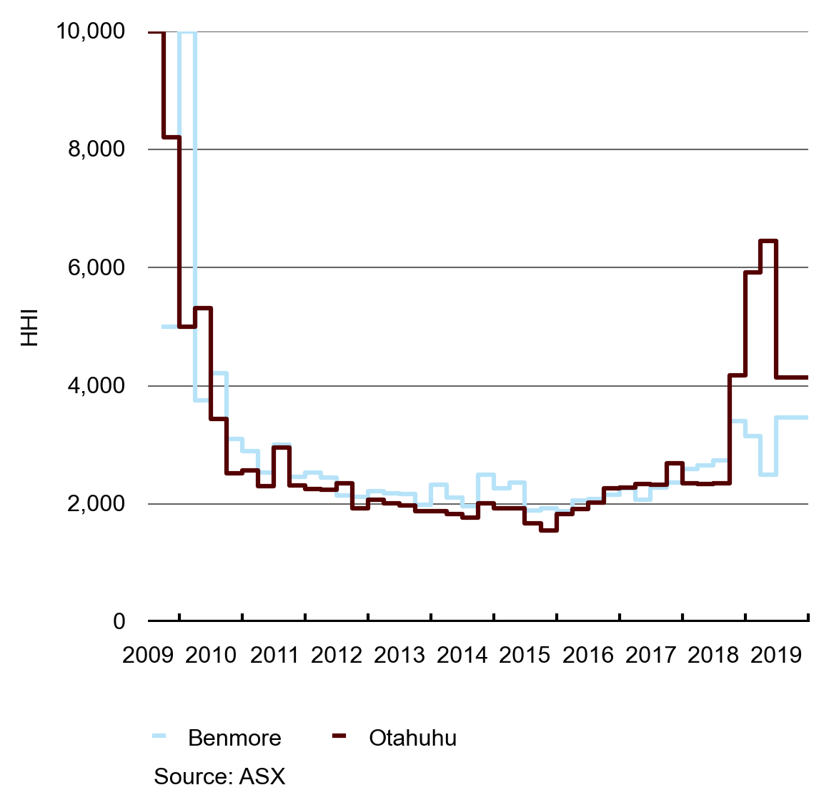
Figure 17 shows HHI values for the sellers of futures contracts on the ASX at the Benmore and Otahuhu trading locations.
Performance: Futures market activity increases
Futures contracts are important as they allow buyers and sellers to efficiently manage their risk positions. This can help facilitate market entry for new retailers and generators.
The four largest generator-retailers all market-make on the ASX futures market. This means that they post bids and offers in the market each day and stand ready to transact at these prices. If other parties hold a different view about future price levels, they can buy or sell contracts that they feel have been mispriced. This diversity of views is what helps to produce a robust forward price curve, allowing parties to make informed investment decisions.
In 2015, 18,468 GWh of contracts were traded, a 36 per cent increase on 2014’s trading volume. We tend to see an increase in trading volumes when hydro storage is low as purchasers use the ASX to manage their spot price risk. In 2015 this is evident between March and June when storage was lower than average.
Figure 18: Monthly trading volumes for ASX baseload quarterly contracts
Figure 18 shows the monthly trading volumes for the ASX quarterly baseload futures contracts. These contracts are the most commonly traded product on the ASX.
UOI is the total number of outstanding contracts that are held by traders at the end of each trading day. In other words, it represents the number of contracts that have not yet been exercised (in the case of options), offset (by holding a contract with a counterbalancing obligation) or expired. Open interest is a measure of ‘skin in the game’ and is an important indicator of liquidity. Greater liquidity generally results in more efficient pricing.
UOI peaked late in the December quarter in 2015 at greater than 4,700 GWh for baseload futures and over 5,500 GWh for all instruments combined.
Figure 19: Unmatched open interest (UOI)
Figure 19 shows the level of UOI on electricity futures contracts traded on the ASX platform. The chart has a distinctive saw-tooth pattern due to the contract volume of various monthly and quarterly contracts expiring, and decreasing the UOI, on the last day that these contracts are traded.
Performance: Forward hedge contracts do not indicate significant concerns for security of supply in 2019
In October 2015 the market began to process the announced retirements of the Southdown and Otahuhu B thermal stations and the potential of two Huntly coal plants retiring in late 2018.
Figure 20 shows prices for futures contracts in 2019 do not reflect a significant premium when compared to earlier years. One explanation for this is that the market believes either Huntly will not retire, or that some other generator will step in to fill the gap created.
Figure 20: ASX quarterly hedge contract forward curve at Otahuhu
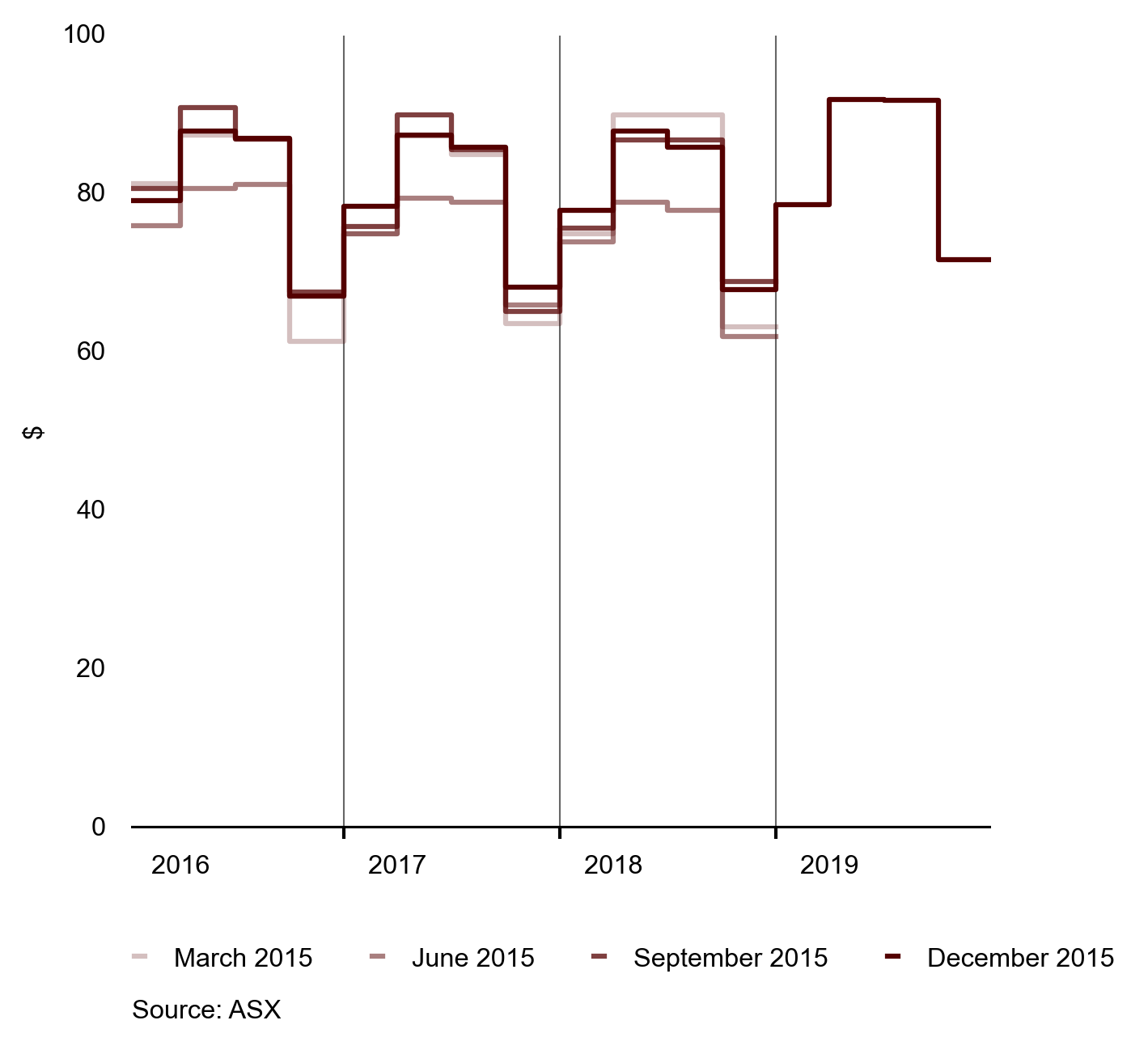
Figure 20 shows snapshots of the forward price curve for Otahuhu at several dates in 2015. The chart shows that futures prices for Otahuhu ranged between $60/MWh and $90/MWh for various forward contracts with higher prices occurring during winter quarters.
Structure: Most Financial Transmission Right (FTR) markets show low concentration
An ASX futures contract helps manage price volatility at a single location. An FTR helps manage price volatility between two locations. We introduced FTRs in 2013 to assist wholesale market participants manage locational price risks on the national transmission grid and, ultimately, improve retail competition. FTRs are sold for future months, so each month is a separate market in the sense that parties have a market share for each month.
Increases in HHI could indicate that a participant or subset of participants may be attempting to establish a position in the FTR market that supports the management of the participant’s locational risk in the market. Alternatively, the outcome may signal that the participant may be attempting to exercise undue influence on outcomes in the energy, reserve or futures market from which that participant may accrue increased profit.
The low concentrations shown in figure 21 suggest a competitive market where no party is seeking to exercise influence.
HHI values are modest for Benmore and Otahuhu and there is no indication that there is significant concentration of the instruments among FTR holders at either location. FTRs for the other nodes show a more concentrated pattern of ownership.
Figure 21: HHI for FTRs at Benmore and Otahuhu
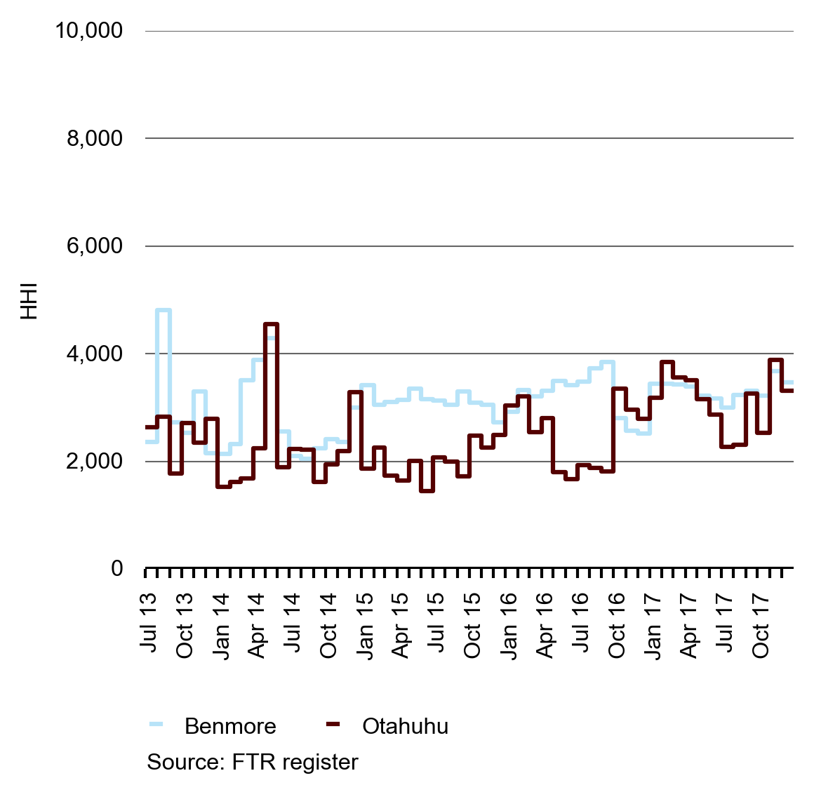
Figure 21 shows HHI for FTR holdings for Benmore and Otahuhu.
Figure 22 shows FTR HHIs for 3 nodes where volumes are lower leading to higher HHIs, particularly at Islington.
Figure 22: HHI for FTRs at Invercargill, Islington and Haywards
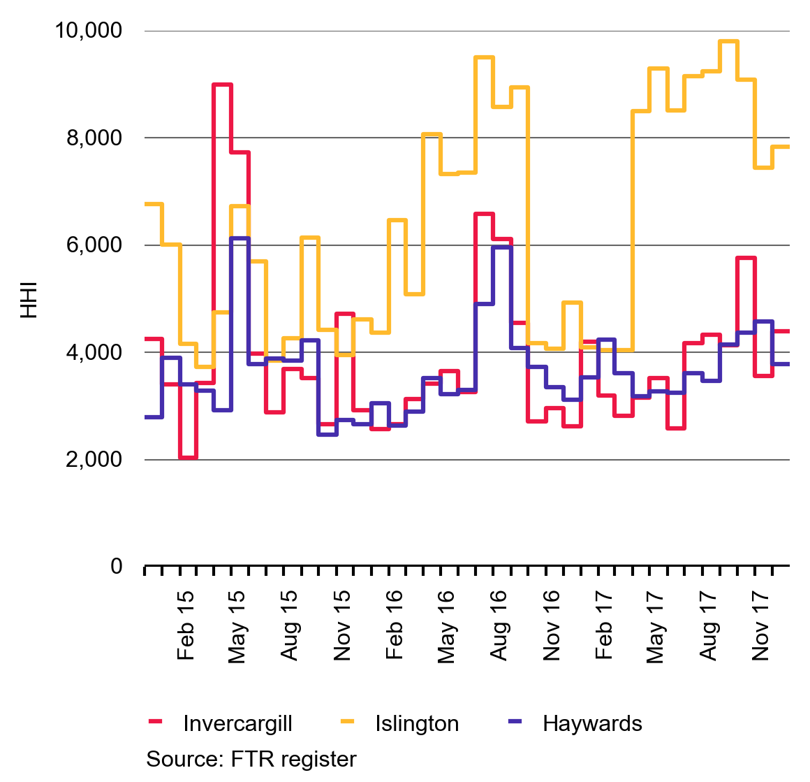
Figure 22 shows HHI for FTR holdings at Invercargill, Islington and Haywards. HHI reflects the distribution of FTR holdings when their settlement was finalised, or as at 31 December 2015 for future dates.
Supply conditions and spot market arrangements
In 2015 the spot market successfully adapted to changing supply conditions while overall concentration levels remained low.
Structure: The spot market continues to have low concentration
Figure 23 shows the HHI for generators. The HHI seems to have stabilised since 2012 with only minor shifts in 2013 and 2014. Daily and seasonal fluctuations in HHI are triggered mainly by variations in supply; potentially as a result of weather conditions, which influence the level of must-run wind and run-of-river hydro generation. Countering this, the smaller capacity and dispersed ownership of thermal plants provide a moderating effect on the contribution from hydro power plants, whose ownership is concentrated. These effects tend to dampen changes to HHI.
It is not surprising that this measure is quite stable as some generator-retailers own both hydro and thermal stations; meaning they can offset one fuel source with another depending on hydro conditions.
Figure 23: Daily generation from HHI from 2002 to 2015
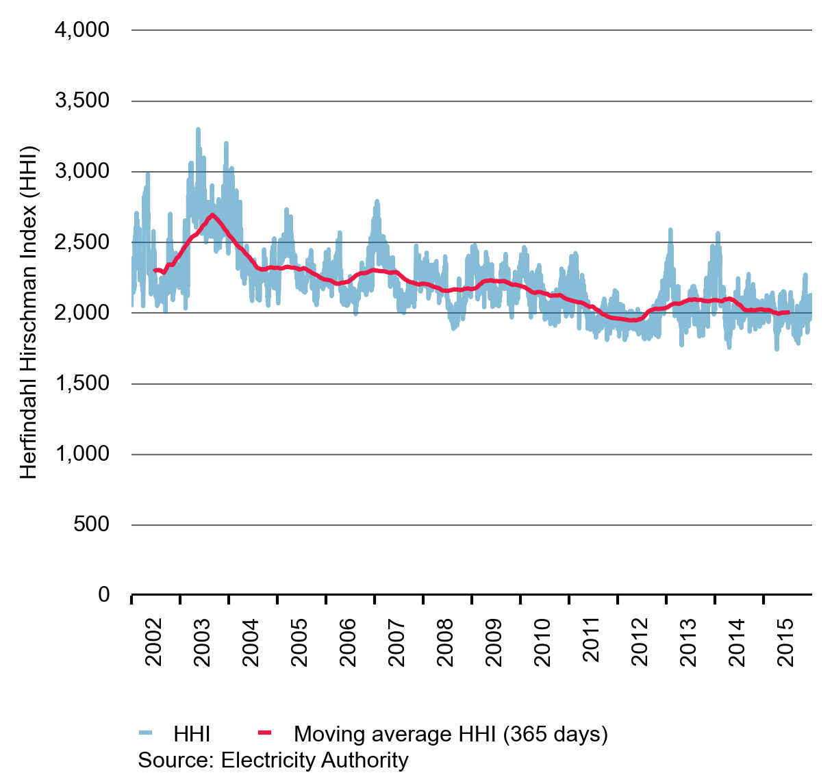
Figure 23 shows the daily generator HHI values from 2002 to 2015 and the annual moving average of HHI values. As with the retail market, HHI provides a measure of how dispersed the market shares are, but here we calculate it for the generation market
Performance: The spot market successfully adapted to changing supply conditions in 2015
Storage levels fell over the first few months of 2015, on the back of low inflows, before rebounding in the middle of the year to track above average levels throughout winter.
Figure 24: 2015 South Island storage compared with 2008 storage
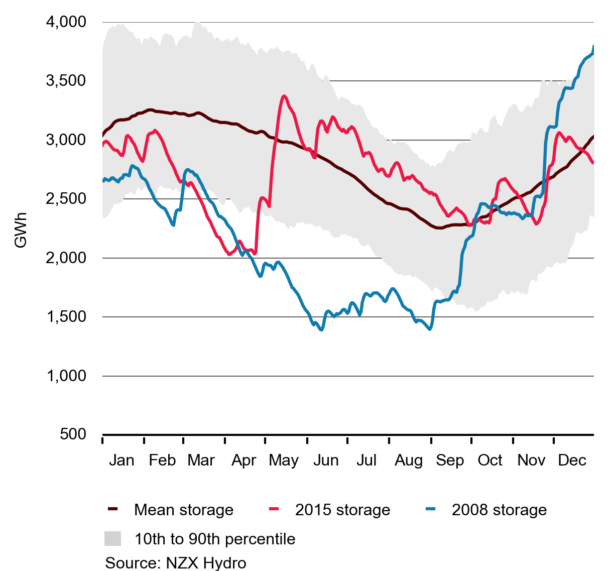
Figure 24 shows how South Island hydro storage levels tracked between 2008 and 2015, compared to mean storage and the 10th to 90th percentile storage range. 2008 is used as a comparison year as it was a particularly dry year.
Figure 24 shows how hydro storage in both 2008 and 2015 tracked at similar levels between January and mid-April, before diverging due to very different levels of inflows over the April to May period.
The level of hydro storage, particularly the amount of stored water at the start of winter, is an important driver of spot electricity prices in the wholesale market. More stored water means that there is more low cost fuel competing to generate. This leads to lower spot prices as hydro generation tends to have low operating costs.
Performance: Storage affects the wholesale price
South Island hydro storage levels typically have a greater influence on price levels as most of New Zealand’s hydro storage is located in the South Island.
Figure 25 shows how the spot price increased to reflect the underlying hydro storage situation early in 2015. This signalled the need for North Island thermal generators to run, as shown in Figure 26. This can result in the reversal of energy flows over the high voltage direct current (HVDC) link as energy flows from the North Island to the South Island. This pattern of flow is shown in Figure 27.
Figure 25: Spot price and South Island storage
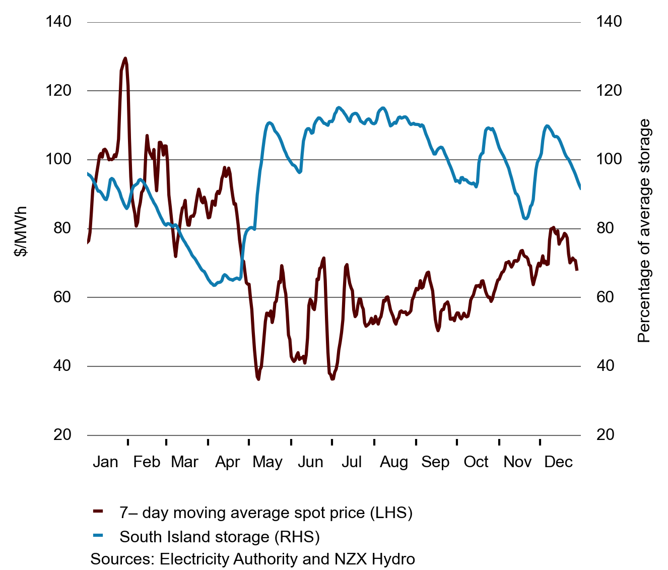
Figure 25 shows the impact that South Island hydro storage levels can have on the spot price. The chart shows the 7-day moving demand weighted average spot price of energy and South Island hydro storage as a percentage of the mean storage for that time of year.
Performance: Low storage encourages thermal generation to generate
In early 2015, when South Island storage fell below 90 per cent of the average storage level, thermal generation increased steadily until late April when storage recovered. A steady decline in thermal generation occurred until mid-May, when a modest increase was seen. From June 2015 onwards, storage in the South Island only briefly slipped below mean levels, leading to relatively low thermal generation.
Figure 26: South Island storage and daily thermal generation
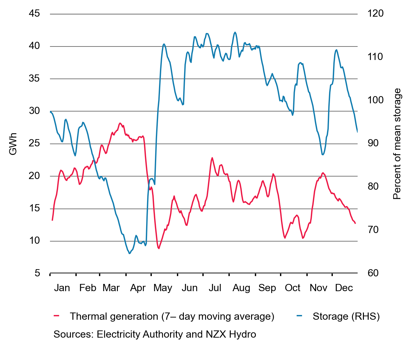
Figure 26 shows the relationship between thermal generation and South Island storage as a percentage of the mean storage for that time of year. It shows the seasonal fluctuations in storage and the 7-day moving average of thermal generation
Early 2015 demonstrates how low hydro storage leads to higher spot prices, providing thermal generators with the necessary revenue to justify running. In this way the market can have high levels of renewable generation and ensure that there is sufficient thermal capacity to avoid shortages when hydro storage is low.
Performance: Storage affects how energy flows between the islands
Figure 27: HVDC flows and South Island storage
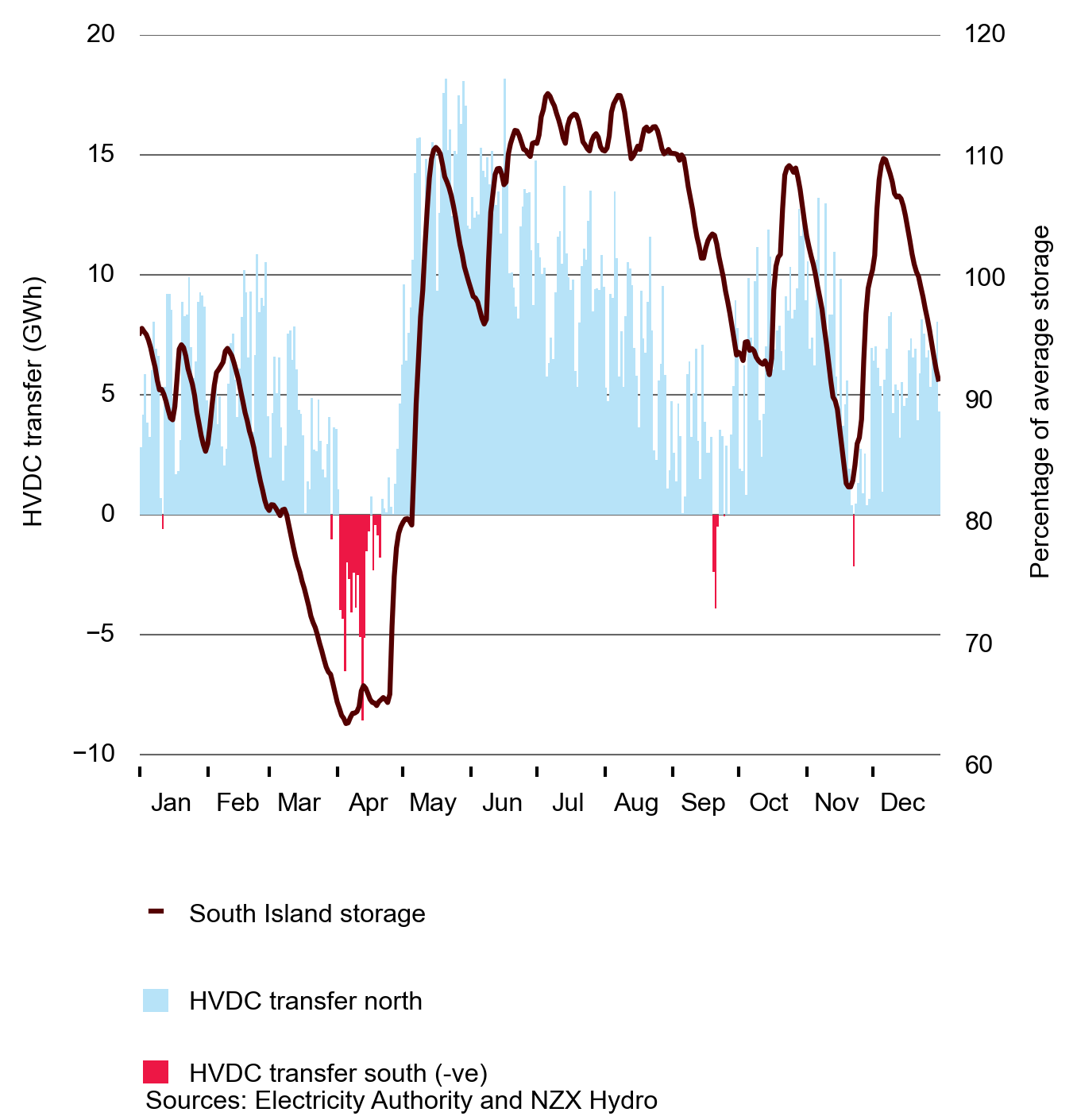
Figure 27 shows the electricity flows on the HVDC and its relationship to the South Island storage as well as the percentage of average storage for that time of year.
The patterns shown in figures 25-27 make intuitive sense as high storage levels lead to high levels of low marginal cost generation. As a result, hydro power generators are more economic to dispatch for extended operating periods. Since these generators are mainly located in the South Island, their dispatch results in flows northward on the HVDC.
Conversely, when the storage level is low, fuel is scarce and consequently costly. Hydro power generators will be economic to run only for brief periods—conserving water for electricity generation during peak periods and those days when the spot price of energy is expected to be high.
During the periods when storage is low and the operation of hydro power generators is limited, North Island thermal generators run, which can result in southward electricity flows across the HVDC.
Figure 28: 2015 monthly thermal compared with average thermal generation for 2009–2014
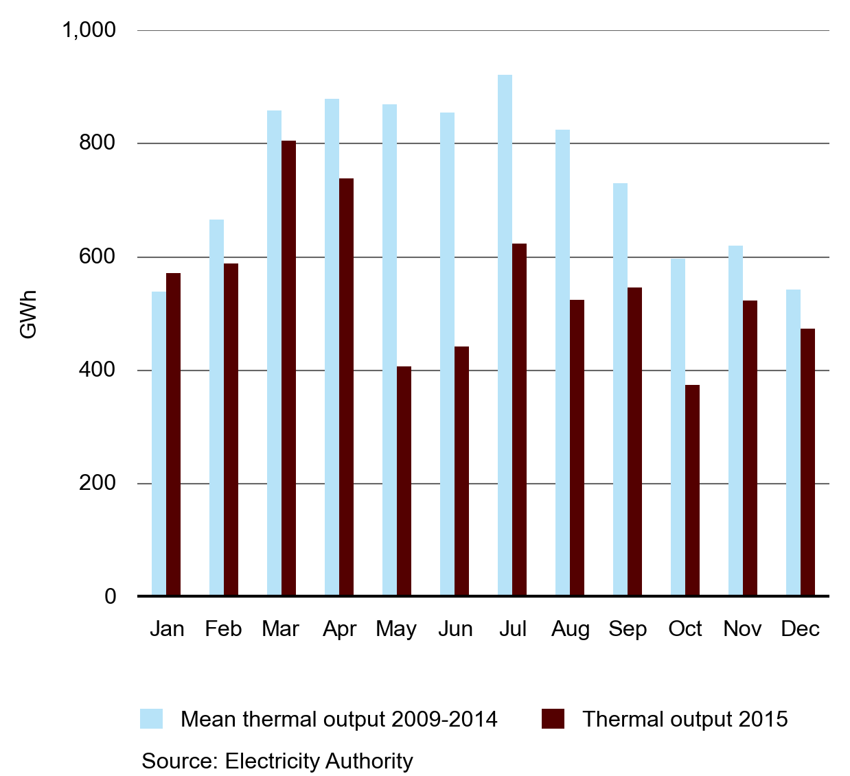
Figure 28 shows the monthly output of energy from thermal generating plants compared to the average monthly output for 2009 to 2014. The chart shows the decreasing role that thermal generation played in 2015 compared to previous years.
Performance: The generation mix in New Zealand is evolving
In 2015, three generators made announcements to close, or potentially close thermal plant:
- Mighty River Power announced on 24 March 2015 that its Southdown plant (175 MW station capacity) would close in December 2015.
- Contact Energy announced on 17 August 2015 that its Otahuhu B plant (380 MW capacity) would close in September 2015.
- Genesis Energy announced on 6 August 2015 that “The development of lower cost renewable generation, principally wind and geothermal, investment in the HVDC link, and relatively flat growth in consumer and industrial demand for electricity have combined to reinforce the decision to retire the remaining Rankine units.” These two units (500 MW combined capacity) at Huntly would close in 2019, however, “if the market was prepared to pay a price that reflected the cost of operating the plant Genesis would reconsider its position”. Genesis has previously retired the two other Rankine units that made up the original 1,000 MW Huntly station [2].
The thermal closure announcements have increased the system operator’s assessment of potential security of supply risks in 2019 [3]. The increase in potential risk is relative to prior assessments, which showed the market was carrying more generation plant than was efficient to manage security of supply risk. However, the market will work through options to manage this risk. Since the large generating companies are now listed, these workings are being played out more publicly than before. It is interesting to note that the forward price for 2019, as seen in Figure 20, is not largely different from 2018. This indicates that the market is expecting the potential heightened security of supply risks in 2019 to abate.
--
2. https://www.genesisenergy.co.nz/documents/10180/4693417/Genesis%20Energy%20announces%20timetable%20to%20end%20coal-fired%20generation%20in%20NZ%206%20August%202015.pdf
3. https://www.transpower.co.nz/sites/default/files/bulk-upload/documents/Security%20of%20Supply%20Analysis%20of%20Thermal%20Decommissioning.pdf [PDF]
--
Figure 29 shows part of the reason for the announced thermal closures. Thermal output has decreased each of the last 3 years while geothermal has increased. In effect geothermal is replacing thermal generation in the generation mix.
Figure 29: Generation by technology type for 2011–2015
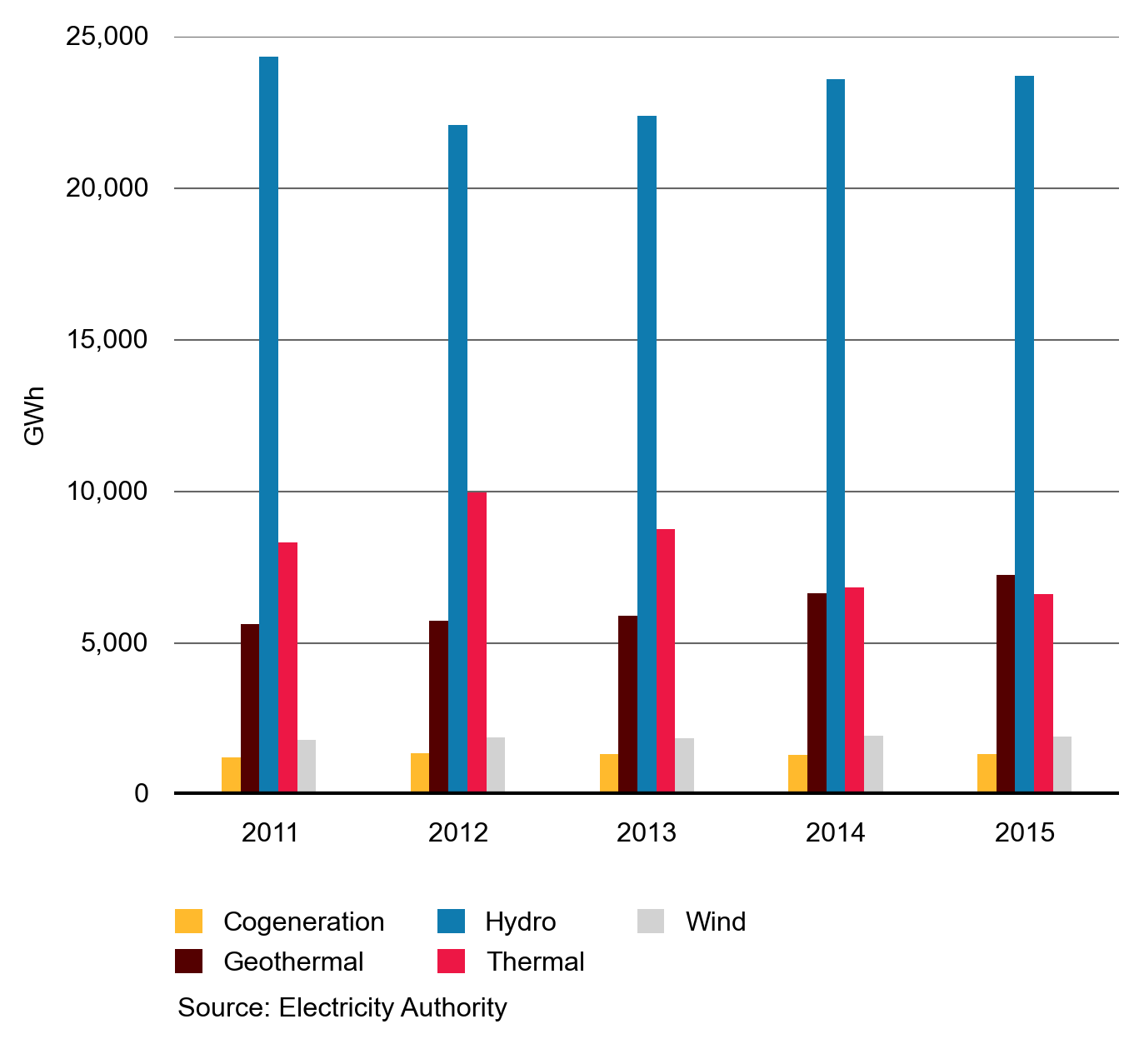
Figure 29 shows the relative contributions from the various types of generation technologies for the years 2011 to 2015. It shows the increase in geothermal generation at the expense of thermal generation. Cogeneration was fairly stable during this period.
Performance: Fewer trading periods where large price swings are likely
We have developed an aggregate measure of the shape of the supply curve near the equilibrium point. This model provides an indicator of generator incentives to increase spot prices. If generators all faced similar incentives, we would see many trading periods where prices would increase sharply for small changes in demand. In 2015 we only observed five out of 17,000 half-hour periods (less than 0.001 per cent of the time) where this was the case. We calculated this result using vSPD (vectorised scheduling and dispatch model) to simulate what market outcomes would be if total New Zealand demand were 2.5 per cent higher for each trading period since 2010.
The counts for 2015 are lower than the counts recorded for 2014 for each island; this could indicate several things. It could indicate that, relative to 2014, tight-supply conditions occurred less often during 2015, or it may indicate changes to generator offer behaviour.
Using the same generation offers with demand increased by 2.5 per cent (across all New Zealand), vSPD is re-solved and the new price recorded (at Benmore for the South Island and Otahuhu for the North Island). We then count the periods where the price has increased by more than $1,000 as a measure of ‘steepness’ of the offer curve. The results are shown in figures 30 and 31.
Figure 30: North Island count of price increases greater than $1,000/MWH caused by 2.5% increases in demand
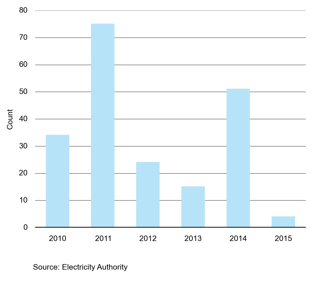
Figure 30 shows the count of spot prices greater than $1,000/MWh in the North Island.
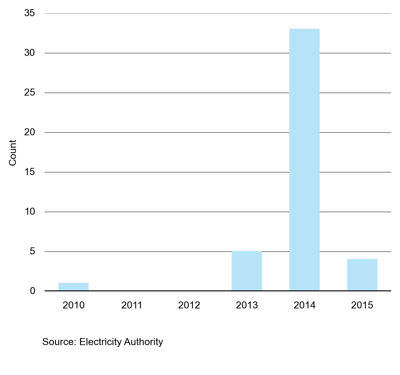
Figure 31: South Island count of price increases greater than $1,000/MWH caused by 2.5% increases in demand
Conduct: We continue to monitor net pivotal positions
A generator is considered net pivotal when it has the incentive to exercise a pivotal position. A pivotal generator is a generator that is needed to satisfy the energy and reserve requirements in the spot market. Figure 32 shows the degree to which generators have been net pivotal in the wholesale market since 2010.
Figure 32: Net pivotal trading periods
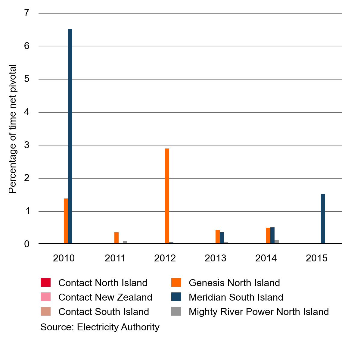
A pivotal generator has the ability to unilaterally influence spot market prices by offering its generating capacity at offer prices above competitive levels. If a pivotal generator has financial incentive to exercise this ability then the generator is termed net pivotal. Whether a generator is net pivotal relies on the magnitude of their demand (their physical position) and financial positions in other markets.
In the analysis, the net pivotal calculation has two parts. The first part requires determining each generator’s pivotal position. The second part estimates the incentive for a generator to exercise its pivotal position.
The first part is conducted through experimentation with vSPD. This is achieved by increasing the island-wide energy and reserve offer prices of the studied gentailer (generator and retailer company) to $30,000/MWh and simulating the result. If one or more generators of the gentailer is dispatched and setting the island marginal price at $30,000/MWh, then the gentailer is considered pivotal and the magnitude of the dispatched quantity is recorded in MW. This is the generator’s pivotal magnitude.
The second part of this calculation estimates whether there is incentive for the pivotal generator to influence the spot price. This is achieved through estimating the total net revenue a gentailer would have gained if it offered energy and reserve at such high price. The total net revenue is the sum of net revenue at all locations and calculated by multiplying the various quantities by the relevant prices and summing to get a total.
Note that this is a change from how the Authority has measured this in the past where we previously used volume rather than price to estimate the periods when a generator is net pivotal.
A positive net revenue result indicates that a generator can profitably raise its offer prices above the competitive level. In contrast, a negative result indicates that it is unlikely that the generator can profitably influence the market outcomes in the energy or reserve market, or both.
There are six studied scenarios that estimate the net pivotal position of Contact Energy in the South Island, the North Island and nation-wide, the net pivotal position of Meridian Energy in the South Island and the net pivotal position of Mighty River Power and Genesis in the North Island.
The net pivotal calculation does not take into account HVDC rental revenue when there is price separation between the two islands. Currently, HVDC rental revenue is allocated to South Island generators of which Meridian has around a 70 per cent share. As a result, the effect of Meridian’s net pivotal impact may be underestimated.
Two important assumptions are implied in this analysis:
- Calculating the gross pivotal position can end up with quite different power system conditions to those modelled in the pre-dispatch schedules and final pricing. vSPD does not build its own transmission constraints, so there is a chance that some results fall outside a feasible transmission operating region.
- In calculating the net pivotal position for each generator, an assumption is made about the profile of the virtual asset swap agreements, and all hedge market activity disclosed on the hedge disclosure website. If better or different data becomes available, the estimate of the generator’s net pivotal position is revised.
Ancillary services markets: Cost continues to fall
Ancillary services costs have shown a steep decrease since frequency keeping control (FKC) was introduced in October 2014. FKC allows the purchase of less energy from generators for frequency keeping compared to previously. FKC uses the control systems that were developed to support multiple frequency keeping, which was introduced by the Authority in 2013. Both multiple frequency keeping and FKC were enabled due to enhancements to the HVDC link as part of Transpower’s HVDC Pole 3 inter-island link project. Transpower completed this project in late 2013.
Figure 33: Ancillary services costs
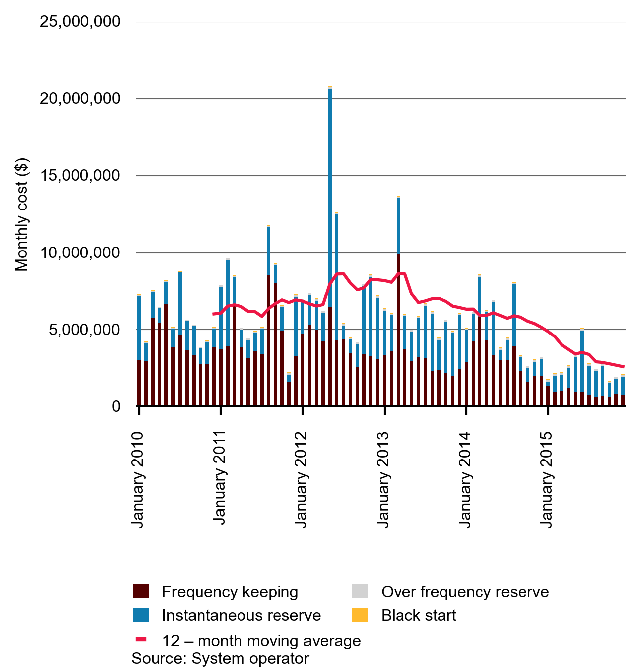
Figure 33 provides a breakdown of frequency keeping and instantaneous reserve costs since the beginning of January 2010. The 12-month moving average for ancillary services costs has continued to decline since the beginning of January 2013.
The cost decrease shown in figure 33 was mostly driven by lower frequency keeping costs and the overall decrease in ancillary services costs between 2014 and 2015 was 30.5 million dollars - these reduced costs will flow through to consumers. Frequency keeping costs are looked at more closely in figure 34 below.
Figure 34 shows that the availability fee paid to generating plants performing the frequency keeping role has been decreasing and constrained-on payments to generators have all but disappeared from the market since the beginning of 2015. The steep decline in costs in 2015, shown in figure 34, is most likely attributable to the impact of FKC.
Figure 34: Monthly frequency keeping costs normalised by demand weighted average spot price
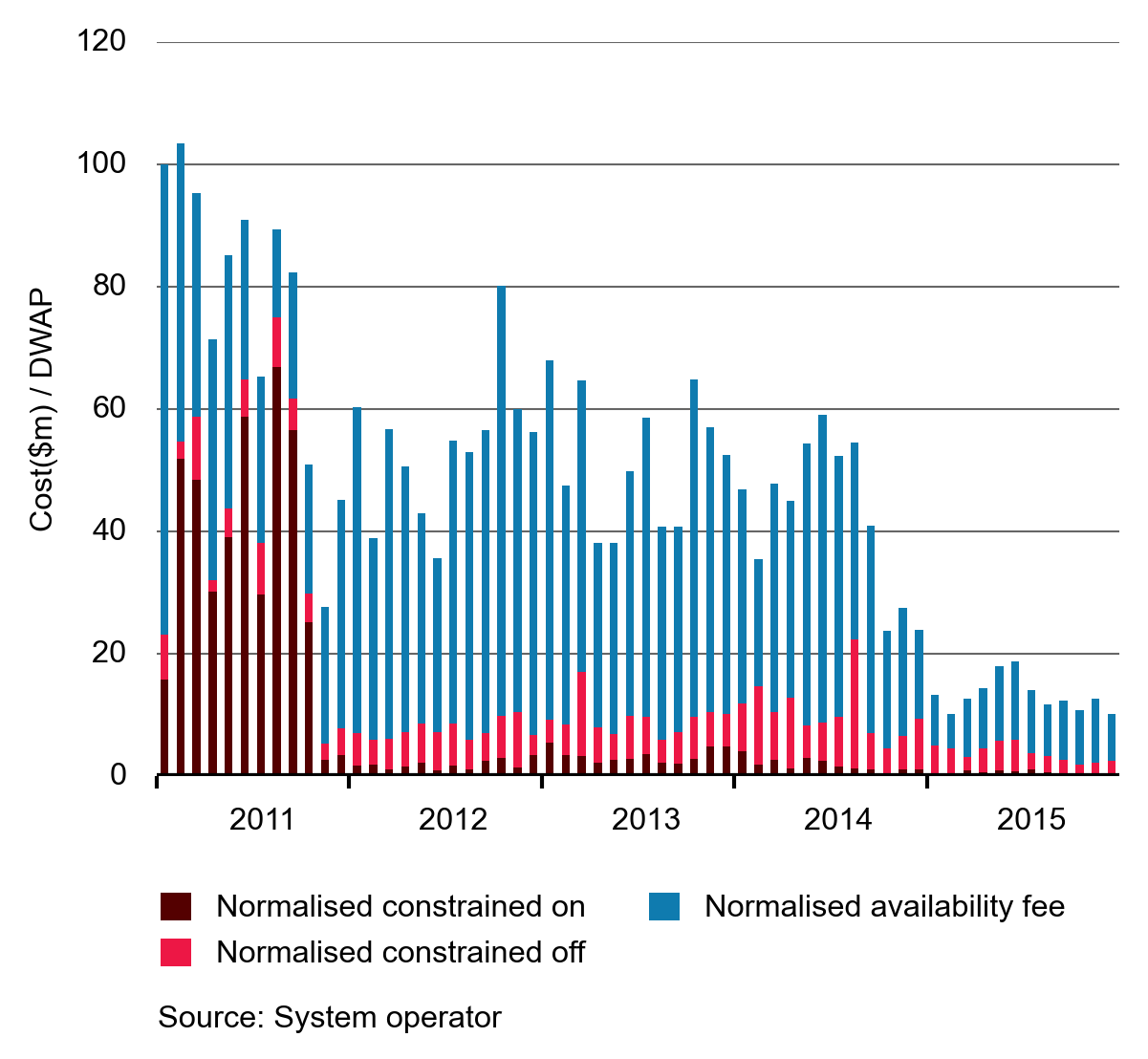
Figure 34 shows the monthly total frequency keeping costs scaled by the demand weighted average spot price, then indexed. Scaling frequency keeping costs by the demand weighted average spot price (DWAP) neutralises the effects of the energy spot price on the frequency keeping market. Indexing the data means that changes can be seen more easily. Because any influences from the spot price are removed, comparisons of frequency keeping costs across different time periods become much easier to conduct.
We calculated a separate index for frequency keeping and instantaneous reserves to make comparison easier. Figure 35 shows that the frequency keeping index fell quite rapidly after 2013. From 2010 to 2015, frequency keeping costs have declined by more than 80 per cent.
The instantaneous reserve costs initially increased between 2010 and 2013, fell in 2014 and increased slightly in 2015.
Figure 35: Frequency keeping and instantaneous reserve costs for 2010 to 2015
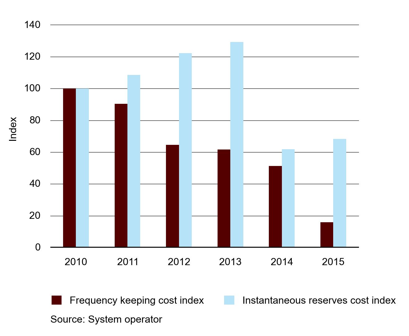
Figure 35 shows the indices for annual frequency keeping and instantaneous reserve costs from 2010 to 2015. Each index is calculated by dividing the total for each ancillary service cost category by the demand weighted average spot price for energy to remove the effect of the spot market price on these individual costs
The HHI is closely associated with the concentrated ownership of generation plants in the South Island and the presence of more diverse ownership of generation plants among many generators in the North Island.
Figure 36: HHI for reserve market
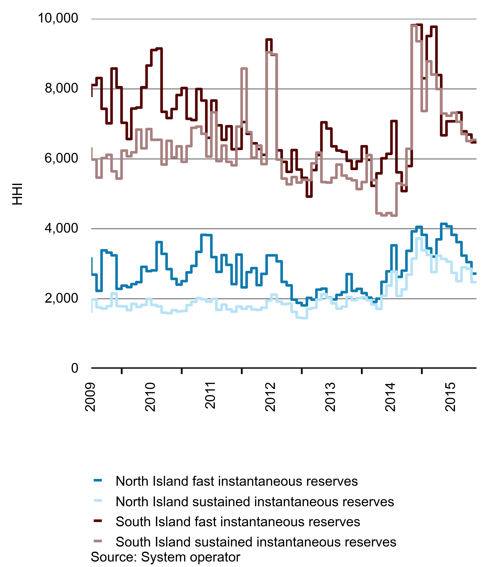
Figure 36 shows HHI values for the fast and slow (sustained) instantaneous reserves market for each island. Figure 36 shows that the reserve market in the North Island is less concentrated for both reserve products than the South Island, given the lower HHI values observed.
Reliability
Reliable supply was an area of focus in 2015 with the Penrose substation fire.
In the early hours of Sunday, 5 October 2014, a neighbour reported a fire at Transpower New Zealand Limited’s (Transpower’s) Penrose substation. The fire resulted in a major outage to electricity supplies in parts of Auckland.
The fire was caused by the electrical failure of a cable joint in a medium voltage power cable owned by Vector Limited (Vector). The fire led to a widespread loss of supply due to the location of the cable joint in a trench containing a total of 3.99 km of power cables in 38 separate lengths (including 19 high-voltage cable circuits, 15 cable joints and a number of control cables). The trench was not sealed from the air and the other cables provided ample fuel for the fire. The trench had no fire suppression or detection despite containing critical infrastructure.
The power cables in the cable trench directly supplied over 39,000 electricity customers in Auckland. However, a total of 75,339 customers were affected by the fire because further electrical circuits had to be switched off to enable safe access for fire-fighting personnel. Electricity was progressively restored throughout Sunday and Monday and supply was restored to the final customers on the afternoon of Tuesday, 7 October 2014.
The response of the New Zealand Fire Service (NZFS), and of Vector and Transpower personnel, was successful in bringing the fire under control and significantly limiting the potential consequences. The fire had the potential to cause much wider damage and disruption to power supplies than in fact occurred.
The risk of a cable trench fire at Penrose had not been identified
Upon request from the Minister of Energy and Resources, the Authority undertook an inquiry under Section 18 of the Electricity Industry Act 2010.
The Authority found that, before the fire, neither Vector nor Transpower had identified:
- the risk of fire ignition from failure of a power cable in the Penrose cable trench; or
- the risk posed by multiple power cables co-located in the Penrose cable trench.
Neither Vector nor Transpower took steps to prevent a fire in the cable trench at Penrose or lessen the supply interruption impact of such a fire on customers.
A 33 kV indoor switchgear building and transformers are located close to the fire. If the fire had destroyed these facilities, the impact would have been much greater.
Lessons from the Penrose fire
Risk management is a fundamental part of owning assets, and in particular power system assets that people rely on. Two lessons from the Penrose fire are that assets that are critical for supplying customers need to be identified and prioritised for risk assessment and that assets should be assessed based on their characteristics.
The Penrose trench was supply critical because in many cases it contained pairs of supply cables that were each other’s back-up. This should have meant it was a priority for risk assessment. Had the trench been assessed on its criticality, and managed, such as through separating the cables in two trenches as designed in the permanent solution at Penrose, then the fire may have been less severe. In the event, the cost to consumers ranged between $47 million and $72 million, and this could have been avoided.
The cable trench had characteristics similar to a cable basement of a switch room in that it had a large number of cables that ran close together. Modern design standards for cable basements include one or more of fire separation, fire detection and fire suppression. If asset owners were to compare their existing assets against present-day design standards to identify deviations for further investigation, the risk of this sort of incident would be reduced.
Another issue at Penrose that contributed to the risk of the cable trench not being identified was the mix of ownership of the assets involved. The trench was on Transpower land and the power cables it contained belonged to Vector. Further, it took a considerable period during the investigation to establish ownership of the trench and the legal framework under which Vector assets were able to be installed on Transpower land. Communication with customers during the fire worked well. Vector and Transpower used a variety of channels including social media and Vector’s smartphone outage application which helped keep customers informed about the outage.
After the fire, restoring supply was a huge job. Vector’s network was reconfigured so that customers could be supplied using undamaged cables. About 450 people worked on restoring the site and work proceeded 24 hours a day for about a week. A new 1.6 km cable was run at Penrose substation. Vector had sufficient spares available from its own supplies, and from its suppliers, to ensure sourcing material didn’t hold up repairs.
A fire in a substation is very dangerous because of the risk to fire fighters of working near high voltage equipment. The fire at Penrose was extinguished safely; however, there was no post event review of safety by Transpower—which has control of the site—and the NZFS. Ideally this would have happened immediately after the fire to ensure all lessons from the fire were captured—in particular how safety protocols worked during the event and whether they could be improved, and any lessons regarding how sites are de-energised to ensure safety. Transpower, Vector and the Fire Service have now initiated a review to capture the safety lessons from the fire.
The Security and Reliability Council—an independent statutory body consisting of industry experts—endorsed the findings of the inquiry. Transpower and Vector accepted the findings of the report and since the fire have completed actions to remedy some of the issues highlighted in the inquiry report. Transpower and Vector have also developed a joint implementation plan to address all recommendations in the inquiry report, and the Authority will monitor progress against this plan.
HVDC Trip on 11 December 2015
Just after midnight on 11 December 2015, the HVDC tripped due to a suspect signal from a current measurement device at the Hayward’s end of the HVDC. The HVDC was running at 90 MW at the time. It was fortunate that the transfer at the time was so low as a bi-pole trip at high levels of transfer can have serious consequences as shown by the November 2013 HVDC runback event.
From a risk identification perspective, the current measurement device is a single point of failure. The Authority has asked Transpower some preliminary questions about the incident, and may investigate this event more closely depending on the information gathered
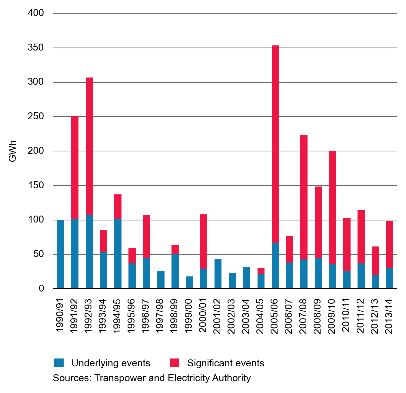
Transmission reliability shows variation from year to year
As in previous years we have used Transpower’s Quality Performance Report to chart annual transmission reliability. Figure 37 shows unserved energy due to underlying events and events that are significant. Transpower defines significant events as events that last more than one system minute, underlying events are those that last less than one system minute. A system minute is energy used during the highest demand period of that particular year. There is significant variation from year to year and the Quality Performance Report details the reasons for the significant events.
Figure 37: Transpower reliability data
Market Performance Enquiries
Completed Enquiries
Phase two of price check enquiry
This enquiry was completed and published in October 2015.
The conclusions from phase 2 were the same as in phase 1. We found that retailers provide good information to their customers about the sources of price increases.
Post implementation review of multiple frequency keeping (MFK) in the North Island
This enquiry was completed and published in November 2015. The enquiry found that, while MFK didn’t lower frequency keeping costs in isolation, it was however a necessary condition for frequency keeping control, which did have a marked effect on frequency keeping costs.
Metering
This enquiry was completed in November 2015 and a short summary was published.
The enquiry found that contract terms and conditions determined the price that retailers paid to metering service providers. This enquiry used confidential data and the Authority therefore only published a short summary.
Switching behaviour
The enquiry was completed and published in August 2015.
This enquiry used survey data to explore the behaviour of residential consumer’s switching behaviour.
Penrose
This Section 18 review was released by the Minister of Energy and Resources on 26 November 2015.
Review of Flick Energy’s price forecasting
This review was completed and published in January 2016.
The review assessed how Flick’s retail offers are ranked against other offers on Consumer New Zealand’s Powerswitch website. The review found that Flick’s price forecasts were not systematically under-estimating spot electricity prices.
Enquiries underway
Demand side bidding and forecasting (DSBF)
We are undertaking a post implementation review of the DSBF regime that was implemented in 2012. This review involves assessing DSBF against what it was expected to achieve when the scheme was implemented.
Reserve energy scheme
We are doing an enquiry into the reserve energy scheme. This enquiry is looking into how the presence of the plant at Whirinaki influenced spot market offer behaviour under its various ownership arrangements.
2-hour revision rule
We are looking into the 2-hour revision rule, to determine if there is any correlation between the spot price and generators making offer revisions within the gate closure period.
June high prices
There were relatively high prices in June 2015, with the demand weighted average spot price over $200/MWh for 16 trading periods over a four-day period. The previous two years only had three trading periods in total when the demand weighted average price was more than $200/MWh. We are reviewing the situation to determine the causes of these prices.